Our certified color consultants are available for all of our paint clients to help with the color selection process. Choosing paint colors can be a stressful affair, but working with a paint color professional can simplify the process and guide you to colors you will love. We currently have two consultants that you may work with, and although we pride ourselves on being flexible enough to meet any clients needs each designer certainly has a specific style.
Meet Lexi Thompson – Fresh, Funky, and Inspired

Lexi is our most senior color consultant and has been in the painting industry for over six years. She has a passion for making the paint color selection process fun and working with clients to find colors that inspire them and transform their space. Lexi uses her years of experience and loves pulling inspiration from vintage designs, artwork, and current trends to find colors that will “wow”.
What’s Lexi’s Color Signature?
A designer’s go-to colors are ever changing and evolving and Lexi is no exception. With that being said, she is known for introducing pops of color that draw the eye in and create a focal point. Whether on a front door, with an accented trim color, or even using colors in nontraditional ways, like bringing color up onto the ceiling, she is always looking for a way to surprise her clients and engage the eye.
Lexi particularly enjoys working on larger, more complex projects like our Denver Victorians or playful homes such as those within the mid-century modern realm. She appreciates the opportunity to collaborate with her clients to find fresh new ways to highlight the unique features of these homes while honoring the history of these designs.
Some of Lexi’s Favorite Paint Projects
Dynamic Accent Walls

Working with a client who isn’t afraid of embracing colors is always a joy. As a color consultant, Lexi loves to seize these opportunities. This particular client had a very eclectic style and wanted to make sure of a dynamic set of accent walls. When it comes to coordinating several colors together Lexi finds it’s helpful to choose a theme for the space. In this case, Lexi and our paint client went with a slightly retro desert inspired color palette.


The different use of each paint color brings an interesting contrast to the space while infusing it with personality. Although making use of several different colors can feel overwhelming it’s also a great way to create a lot of visual interest and keep the eye moving throughout a space.
Playful Pops of Paint Colors

This exterior was a ton of fun because the client was looking to brighten up their dark exterior and was hoping to add some playful pops of color. In order to accomplish this, they chose to go with an allover neutral for both the body and trim.
The use of Whitetail SW 7103 helped create a canvas for the brighter colors to really pop against without feeling out of place. Making your trim and body color the same paint color is also a great way to remove the visual business of trim. So if your home has a lot of trim and you’re not a fan, then this can be a great solution.
The client had a very particular vision for the shutters and front door that was inspired by mid-century homes as well as coastal elements. After much deliberation they chose to go with Waterfall from Sherwin Williams and Frolic SW 6703 on the front door. The strategic use of these colors and their placement work with the home to bring visual interest without making things too busy. The clients loves it and we couldn’t be happier with the transformation.
Melding Traditional Elements with Interesting Contrast

Victorians can be intimidating for both clients and color consultants and this beautiful Denver home was no exception. This client was itching to bring some fun color back into the intricate details of the home after years of beige. When you’re going from a very simple scheme to a much more complex scheme, it can be difficult to visualize the final product so digital mockups were a must for this client.
Even with a relatively small painting area we landed on a total of SIX colors for this exterior. Lexi and the Kind Home paint client chose to create harmony by sticking to a single color family that would contrast the current brick color. The detailed pattern adds a ton of visual interest to the front of the home and helps to honor the historical beauty and integrity of these Denver homes.
Meet Yasmine Kot – Earthy, Classic, and Grounded

Yasmine is a bit newer to the painting world, but she uses her years of experience in marketing to create engaging spaces that work seamlessly with the vision held by each of her clients. Yasmine tends to favor classic color schemes that are harmonious with the Colorado landscape while also finding ways to incorporate current trends in a way that feels intentional and timeless.
What’s Yasmine’s Paint Color Signature?
With color trends changing frequently it’s important for designers to stay on top of things so they can bring valid and thoughtful input to each project. Yasmine is known for her use of earth tones and dark dramatics to create warm, balanced spaces that you want to sink into. She is inspired by nature and strives to bring life into spaces, often with an unexpected twist. Yasmine loves a dark dramatic trim color, rich accent walls, and subtle contrast that creates an elevated and elegant finished look.
Interior transformations are a favorite of hers along with clients who are looking for traditional and timeless exterior schemes. Painting your brick can feel intimidating but the transformation can be absolutely jaw dropping with the right color choices. She is always considering the fixed features within a space and uses those to guide her color selection in an effort to create a perfect harmony and balance.
Some of Yasmine’s Favorite Homes
Unique Uses of Paint Color
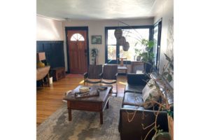
Every now and then you get the opportunity to work with a paint client who really wants to go for something new and unique. This Englewood painting client loved the idea of stepping away from the typical white trim and after talking through quite a few options they landed on Dark Knight SW 6237. By choosing a deep, rich slate blue they were able to create a complimentary color scheme with the existing floor color.
Alternatively, the client was also excited to get rid of the blue in the dining room in favor some more earthy and grounded. Yasmine pulled inspiration from popular 1970’s colors and went with Mossy Gold, a very unique greenish brown that brings a lot of warmth to the space.
Grounded Earth Tones

Sometimes the biggest transformations can come from the simplest changes. This client was eager to revamp her kitchen and was aiming for something earthy and on trend. Green cabinets have been a massive paint color trend for 2023 and Yasmine and the client found the perfect shade with Sage Light Green from Sherwin Williams.
This gray green works so well with the existing backsplash and the updated gold hardware, absolutely transforming the space into the kitchen of our client’s dreams. We couldn’t be happier with how this turned out and feel green will continue to gain popularity amongst clients.
Classic Contemporary Exteriors

Painting your stucco is a great way to keep your home looking refreshed and maintained. When Yasmine met with this client they were really hoping to land on a modern yet timeless color scheme for the exterior and loved the lighter grays. With that in mind they chose Mindful Gray, a warmer light gray from Sherwin Williams and paired it with Snowbound for a crisp, sharp contrast between the body and trim.
The front door is Downing Slate, which is a popular choice amongst clients and adds to the contemporary feel of the home. Getting rid of all the warm yellows and browns really helped this home feel more current and the clients couldn’t be happier!
Benefits of a Professional Color Consultation
Everyone interprets colors differently, which means there are no “perfect paint colors”; however, working with a certified color designer can help remove stress and provide guidance to find colors that will work for your home. To best prepare for your color consultation we recommend looking for inspiration on Pinterest or around your neighborhood to get ideas. Some things to consider are:
- Do you like high or low contrast between body and trim colors?
- How do you want your space or home to feel? Examples might include clean, open, dramatic, warm, inviting, etc.
- Are your fixed features (things you won’t be changing within the space) overall cool or warm in undertone?
- Are there any color families or colors you would like to avoid?
Even when working with a color consultant it’s important that you bring your opinion and vision for the space to the conversation. Ultimately, you are the one that has to live with the colors and everyone has different preferences when it comes to colors they like or dislike. That being said, your home, the surrounding areas, and fixed features must be taken into consideration. These can be limiting factors when choosing paint colors, so it’s best to go into your appointment with an open mind.
If you feel like Lexi or Yasmine could help you narrow down your colors and provide some professional guidance, you can schedule a Color Consultation HERE

